Written by Watershed Staff

One of five interpretive signs designed for the Watson Woods Riparian Preserve as part of its interpretive plan.
Arizona non-profit group Prescott Creeks recently completed a $2 million stream and wetland restoration at Watson Woods Riparian Preserve, and “wanted to showcase what we had accomplished to guests,” as well as meet grant requirements for interpretation, said Gregg Fell, Field Projects Coordinator for Prescott Creeks. Interpretive signs along the new trails would help the 200-300 weekly guests at the Preserve understand the group’s goal of preservation and enhancement of habitat and wildlife.
Prescott Creeks hired The Watershed Company to create five interpretive signs, an orientation kiosk and map, and a tri-fold brochure for the Preserve. Fell said, “We feel lucky to have found The Watershed Company to do this work for us because they so thoroughly understood watershed ecology and could bring that to the interpretive design process.”
Theme Development, Research, and Schematic Mockups (4 Weeks)

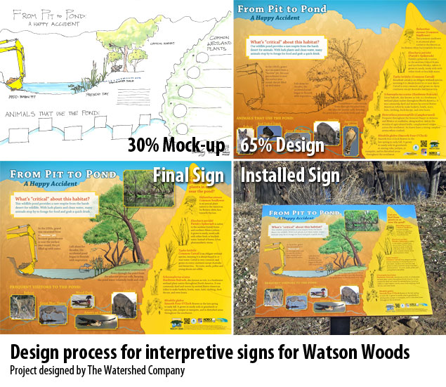
30% mockup for The Gallery Forest interpretive sign.
The process of creating five interpretive signs began with interpretive theme development in coordination with Prescott Creeks, and five signs were decided upon: Southwest Rivers, The Gallery Forest, From Pit to Pond, Stream Restoration, and Granite Creek Groundwater.
Designers created graphic mockups that illustrated the rough layout of each of the interpretive signs. These 30% mock-ups show the planned graphics and areas for text to make sure the content is headed the right direction for the client’s goals.
Style Development (2 Weeks)

Cottonwoods at Watson Woods Riparian Preserve. Photo by Prescott Creeks.

To get a feel for the Prescott area and the Watson Woods Riparian Preserve, we looked through photographs of the area from our client, Prescott Creeks, and that we found online. After getting a sense of the local palette, we decided that the signs should have a slight Western flavor.
Since the cottonwood forest was Watson Woods’ key feature, we decided to use an illustration of a yellow fall cottonwood leaf as a common visual element that would tie the signs, kiosk map, and brochure together. Going through local photographs, we spotted a nearby feature, the Granite Dells, and decided to use its distinctive silhouette as a background for all the interpretive signs. A screened-back print of a cottonwood canopy adds subtle texture to the background.

We developed a color palette that drew from the golden canopy of cottonwoods at the Preserve, the blue of the restored creek at its core, the lush greens of the riparian forest, the orange of the Granite Dells, and the tans and browns of the surrounding dry land. We decided that the signs should be vibrant to stand out from the landscape. Fell reported back, “The warm golden color theme with blue and green accents captures and reflects the colors of the surrounding land and ecology, so it blends in with the environment around it but doesn’t get lost.”
Design (3 Months)
After creating the style guide, we designed the interpretive signs and orientation map simultaneously, then designed the tri-fold brochure last since it would take less time to produce than the signs.
Interpretive Signs and Brochure
From the initial sign mockups, we developed 65% designs that reflected the style we’d created. We used a combination of hand-drawn, colored pencil illustrations for their handmade appeal as well as digital interpretive graphics for a bright, modern feel. Incorporating feedback from Prescott Creeks, we finalized the signs. The coordinating brochure “creates a total package and gives visitors something that they can bring home along with contact information for our organization,” Fell said.
Entry Kiosk
While graphic designers were developing the sign content, landscape architects created conceptual renderings of the entry kiosk, which helped Prescott Creeks envision how it would look on site. They created schematic plans for the selected option, which a local contractor used to build the kiosk.

Installed orientation kiosk with conceptual rendering of early design.
Trail Map
Our GIS folks took data from Prescott Creeks, overlaid it on an aerial photograph, and beautified it into an accurate and visually appealing map that would show users the trails available in the Preserve, as well as Granite Creek’s channel and associated wetlands.

Detail of orientation map
Finished Materials
“Visitors come upon an interpretive sign along the trail every 30 yards or so. It really keeps them interested in what what’s going on at the site,” Fell said. “Developing interpretive materials was a new process for us at Prescott Creeks. The trail signs and brochures developed by The Watershed Company for the Watson Woods project are exactly what we need.”

Gallery Forest interpretive sign installed at Watson Woods Riparian Preserve. Photo by Prescott Creeks.
A large interpretive project truly takes a team – our client and their stakeholders, landscape architects for sign placement and specifications, graphic designers for content design, and GIS analysts for design cartography. We are so excited to see the photos of these installed signs and kiosks in Arizona — the hardest part for us about designing interpretive signs across the nation, being based in Washington State, is not getting to see them in person!